How we use images in our communications helps us to tell a story of who we are, what we represent, and who we want to be.
Communications
Walter Scott, Jr. College of Engineering
How we use images in our communications helps us to tell a story of who we are, what we represent, and who we want to be.
Using images on the web comes down to aesthetic and technical realities that often do not exist in print design. Where a printed page remains the same all the time, web pages are radically different. One person might be looking at the website on a tiny phone, another on a huge desktop monitor.
Web images have to be the correct format, size, resolution, and even colors to make sure they are presented in the most consistent and professional way.
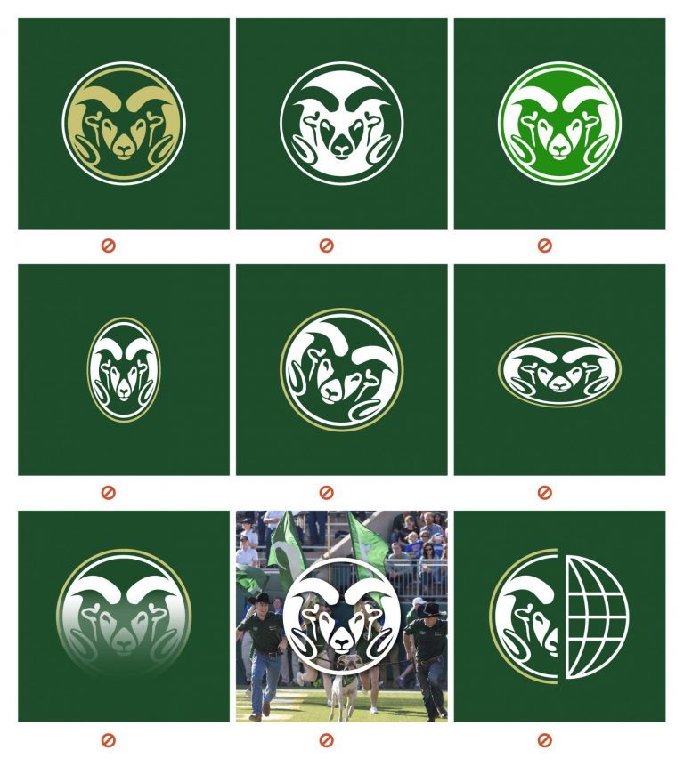
Our logo, signature, and mark standards are based on those in the University’s Style Guide, and all usage must adhere to these brand guidelines.
More information on University brand standards is available here.


Whether it is a department signature, the college mark, or the university logo, all uses in any form must be complaint with college and university guidelines. This includes, but is not limited to:
Using images is a great way to bring attention to a content area, especially an area that features a lot of text. But there are pros and cons to using images, and making the best choice adds consistency and credibility to our website.

Images with less than 256 colors or images that require transparency; logos, design shapes and accents
Full photography or images with many colors
All images must be fully sourced, typically from Colorado State University photographers or departments.
All images should be either free of copyright, or written permission from the owner to use them has been obtained.
Images found through a Google search are not usually free to use. Any images found online must have written permission and be used with full attribution according to any licenses.
Images must include alt tags that include relevant information such as the copyright owner and accessibility information.
NO!

YES!
File formats for the web are limited to only a handful, to make sure that the majority of web browsers and email applications can read them. Print formats, such as TIFF or EPS, are not suitable for web use.
Resolution is defined as how many pixels an image is made up of. For example, a 10 megapixel image, common among camera phones, gives an image that is 3872 pixels x 2592 pixels. That’s larger than most desktop computer monitors, the typical of which is a 27″ monitor at 1920 pixels by 1080 pixels.
That’s also far larger than what nearly any website needs, unless it is for a cropping effect. So, in this case, the resolution is far too high. But let’s say we resave that image to 150 pixels by 150 pixels. If we expand that smaller thumbnail to full screen, to show a photo of the Grand Canyon, there’s little chance we would be able to see the river.
When using images on the web, consider how it will be used. Websites can be virtually any size, so keep in mind how an image may move around within a design.
Just like resolution, using the correct file size is important for visitors. File size refers to the amount of space the file itself takes up on the server, such as 7KB or 23MB.
A note on JPEG compression: Jpg files can usually be saved at medium-high compression percentages (in Adobe Photoshop 60%-70%) to compress well, but not introduce pixelization.

Originally 241 pixels x 313 pixels

Blown up from 24 pixels x 31 pixels to fit the same size
Icons are similar to the images we use throughout the site, but are SVG files from a common set. They are used to bring attention to a specific content area, or visually hint to a visitor what the content is about.
We use a common icon set called Font Awesome throughout our site. The Font Awesome catalog is extensive, freely available for any use, and allows us to feature a consistent style of icons across our web platforms.