We want our visitors to have the best experience possible, and to do that we need to ensure our designs are professional, consistent, and reach the level of excellence the College stands for.
For all of our materials, from the most complex printed booklet to a simple webpage, we create clean designs and craft useful content. Good designs demonstrate accessibility, professionalism, and consistency, and tell our story in engaging ways.
We have a number of objectives we keep in mind to create well-designed materials:
Modern web experiences are based on the idea that the content will be responsive to whatever device it is being viewed with. The design adapts to different sizes immediately, changing the user’s experience no matter if they are on a small phone, a medium tablet, or a huge monitor. Hard and defined measures, like pixels for widths, do not work well in an adaptive environment.
Mobile responsiveness is especially important to both how our users interact with our websites and how Google ranks us. Users want a consistent, professional interface, and content that fails to respond to their needs will force them away from our websites. Google also ranks sites that are responsive higher than those that are not, often going so far as penalizing websites that do not offer mobile-friendly experiences.
Our platforms utilize a responsive design for consistency, accessibility, and adaptability. All content on any of our platforms must be ready for a responsive environment, and have the ability to be viewed correctly at any size.

It is important for our entire audience to be able to view our content, no matter what situation they are in.
We want our content to be accessible, and this Guidebook sets standards for how we achieve those inclusive goals:
Header styles are different than paragraph text styles, in both how they look and how Google treats them.
Paragraph text
The Proxima Nova family of fonts is the default font for all our websites, based on the Colorado State University Style Guide. All of our text, headers, and other typographical use Proxima Nova in various weights.
Proxima Nova paragraph text
Paragraph text, brand default 16 px
Paragraph text, 12 px
Paragraph text, 10 px
Paragraph text, 9 px
Paragraph text, 8 px
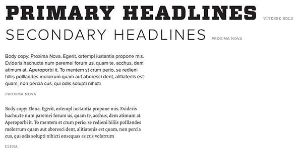
Our print typography standards are based on the Colorado State University Style Guide. Fonts work differently in print than they do in an online environment, and our print brand standards use both serif and sans-serif fonts.
Primary Headlines:
Vitesse Bold
Secondary Headlines:
Proxima Nova
Body Copy:
Proxima Nova, Elena
Fonts can be purchased for use through University Communications.

These general guidelines depend strongly on the individual design and layout of the page, and are suggested defaults. Generally speaking, objects should always adapt to their environments, instead of duplicating for different modes, using modern settings such as em/rem or viewport measurements (vh, vw, etc.).
80% width
Color: CSU Gold
Weight: 1px
Centered
Border Color: CSU Gold
Border Weight: 1px
Background Color: #f7f7f7
Width depends on usage
High visibility for accessibility
Squared edges
Background Color: CSU Green
Text/Icon Color: White (#ffffff)
Reversed color choices in some cases
Border: CSU Gold, 1px
The Elementor Page Builder plugin used by the College sets a default size for icons which is typically acceptable. Icon size should be consistent with the size of the content around it if a different size is needed.
Color choice varies by design and requirements, but should default to either CSU Gold or CSU Green.