Walter Scott, Jr. College of Engineering

Accessibility

The power of the Web is in its universality.
Access by everyone regardless of disability is an essential aspect.

– Tim Berners-Lee, W3C Director and inventor of the World Wide Web

Why we want to make our sites accessible

One of the highlighted values that the College promotes is inclusiveness, and to ignore any segment of our population means we are not living up to our own expectations.

The University not only expects us to follow a policy of accessibility, we want to make sure that we are making it easier for all people to interact with us.

Through a process of working with accessible technologies and techniques, we can offer our content to more people in better ways.

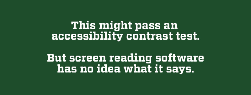
The UN Convention on the Rights of Persons with Disabilities:

"To enable persons with disabilities to live independently and participate fully in all aspects of life, States Parties shall take appropriate measures to ensure to persons with disabilities access, on an equal basis with others, to the physical environment, to transportation, to information and communications, including information and communications technologies and systems, and to other facilities and services open or provided to the public, both in urban and in rural areas."

What disabilities are affected by accessibility issues?

Among the disabilities that should be considered as you create things are:

  • Colorblindness or color deficiencies
  • Visual impairments
  • Deafness and the hard of hearing
  • Learning disorders
  • Users with impaired mobility, including problems with mice and/or keyboards
  • Neurological issues, such as migraine sufferers, or the possibility of triggering seizures

How do we make our content more accessible?

There are many things to consider when it comes to accessibility for all of our audiences. Below are some, but not all, of the steps that should be considered when designing materials.

Step #1:
Using color and contrast

Color plays an important role in how useful a site is for many people, especially those with color vision disabilities. We have adopted a standard of using colors with accessibility in mind for all users.

The charts in this section are provided by the World Wide Web Consortium, and offer a look at how colors are perceived by those with color blindness or impairment. For more information, click here.

sample color wheel demonstrating full color vision
full color, normal vision
sample color wheel demonstrating protanopia
Red-green color blindness, protanopia
sample color wheel demonstrating tritanopia
Blue-yellow color blindness, tritanopia
sample color wheel demonstrating achromatopsia
Achromatopsia, total color blindness

Use good color contrast

Color contrast, the difference in luminance or color between objects, is determined by a ratio of colors. The higher the number compared to one, the better the contrast is.

For example, compare the green and white ratio as “AAA,” which is great contrast, with the gold and white, which fails the test. This page offers a great explanation of what the WCAG guidelines mean in practice.

AAA contrast:
9.76:1 ratio

Contrast fail:
1.83:1 ratio

Step #2:
Always use alt tags for images/media

“Alt tags” are used in HTML to add descriptive text to images, and can aid in navigation. Alt tags can be used with braille, or read aloud on screen readers and other assistive technologies.

Alt tags, and secondarily title and description tags, are required for those with accessibility issues to use our websites easily and without issue. Alt tags should be consistent, concise, and informative as to the image’s function.

Adding alt text in the WordPress Media Library

WordPress has built-in functionality to add title tags, alt tags, and descriptions to any image on the page or in the Media Library.

Screenshot of alt text area in WordPress admin

Adding alt text in social media posts

Social media applications allow for at least images to offer alt tags, often listed as descriptions or even captions. Each service implements accessibility differently and dynamically, please refer to the current requirements on each platform. 

Try not to use text embedded in images

Images should not normally have text embedded in them either. Embedded text can not be read by screen readers, and sometimes is not easily viewed for those with visual impairments. 

Modern CSS styles, combined with images set as backgrounds, can have the same effect and still be usable for those with impairments. 

If there are images where text must be embedded in the image, write the alt tag so that the text in the image is written out, unless that text appears next to the image as well. 

On some social media platforms, using text embedded in an image may be the only option. In those situations, make sure the descriptions/alt tags include the text of the image.

2020 Engineering Student Recognition Ceremony header

Sample alt tag:

Designed image with text "Engineering Student Recognition Ceremony 2020" and Colorado State University Rams logo.

Step #3:
Headings are always in descending order

HTML headings are designed to work in descending order, from a larger H1 header at the top of the page down to H3 or H4 for smaller subheaders. Screen readers will often use the order of the headings to navigate a page.

H1 is almost always the page title/header.

H1 Header

H2 Header

H3 Header

H4 Header

H5 Header

Paragraph text

Headings can also be grouped under particular headers, as long as the descending order is respected.

H1 Header

H2 Header

H3 Header

H3 Header

H2 Header

H3 Header

H3 Header

HTML headings are also never used to make text larger or more prominent. Use normal text or paragraph text, combined with CSS styles, to make non-heading text prominent.

Step #4:
Design for easy text recognition

Design recommendations for accessibility are often similar to those for good design, including keeping things in order.

Font sizes that are not too small (min. 9 pixels)

An example of a font size that is too small

Screen reader test image: "This might pass an accessibility contrast test. But screen reading software has no idea what it says."

Remember #2: Don't embed text in images, since screen reading software will not be able to interpret it.

Think of the page this way:
This is how the Elementor plugin sees each header and content, same as a screen reader:

Table of Contents

Bonus question: Notice anything amiss with the order and heading choices above?

Browser Extensions

There are several web browser extensions available to test how much of a page’s content is accessible. Two examples are:

ACNS and the college also use a license from Monsido for accessibility as well. Contact the college’s Communications team to see if your department is set up.